Risk and Safety Solutions
Reducing manual oversight for 1,100+ program administrators by centralizing case tracking and decision-critical data.
ROLE
Product Design Intern
TEAM
Product Design, UX Research, Development Teams
DURATION
4 months (July 2025 - October 2025)
TOOLS
Figma, Figjam, Dovetail, Zoom, v0, Magic Patterns
CONTEXT
Company

Risk and Safety Solutions (RSS) is a cloud-based B2B SaaS platform for EHS and risk management across universities and hospitals.
Problem
Program admins lack an integrated system to manage and track their data, leading to stress and loss of critical information.
Impact
The new tracking system has been handed off to developers and will replace the main landing page for all program admins (1,100+ users).
Endorsement
"This is one of the biggest value-adds that RSS has had in years. All program admins have use for it." - Lead Designer at RSS
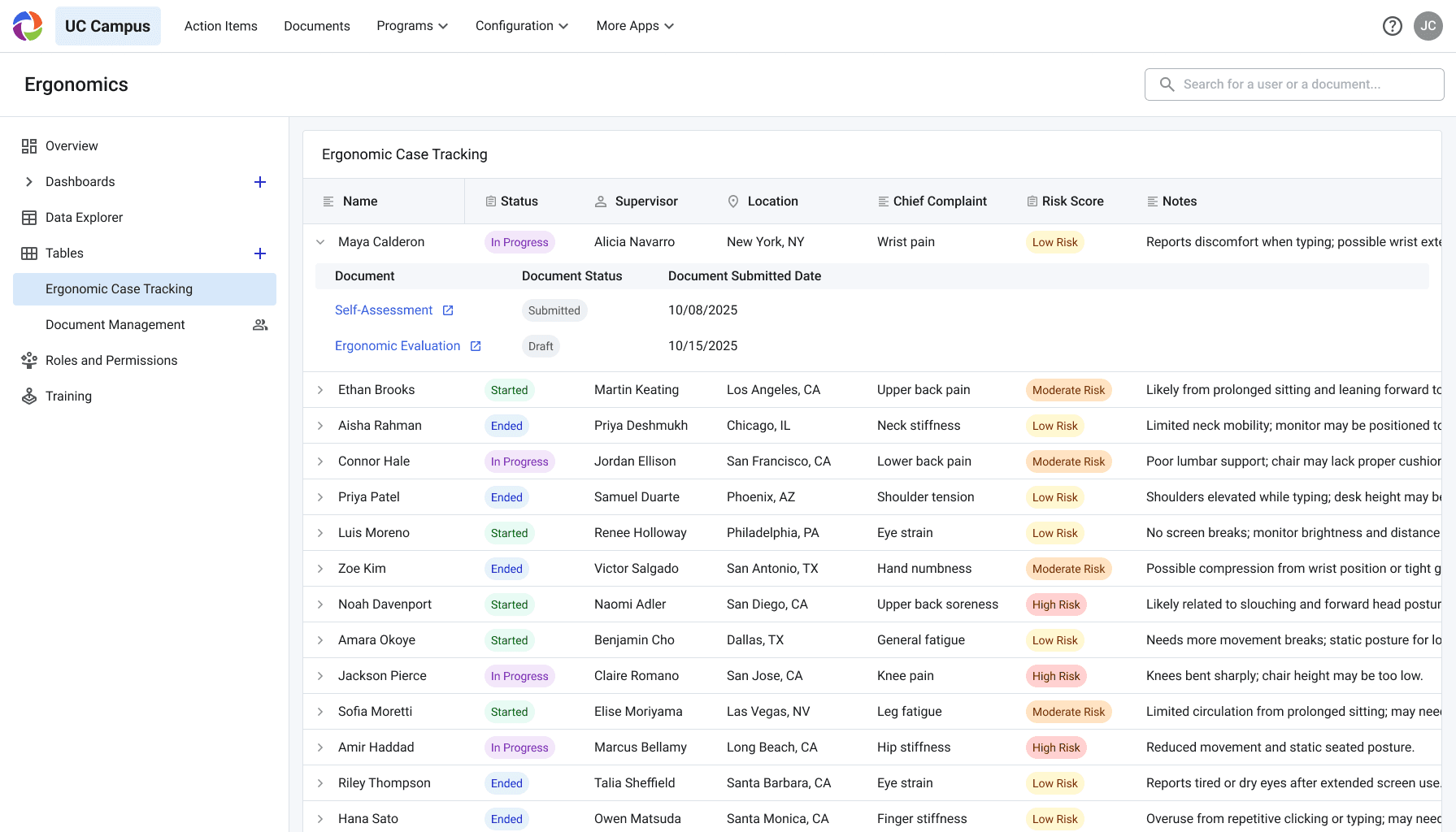
SOLUTION SNEAK PEEK
Track safety information in real time with full ecosystem integration
Old: static document hub

New: dynamic, case-based tracking

Jump to Full Solution
INITIAL RESEARCH
Program Admins were distressed from a lack of an internal tracking system
I was initially tasked to create a scheduling platform, but after conducting interviews, I discovered something unexpected: users didn’t struggle with scheduling. Their real challenge was keeping track of key information throughout their workflow, they were losing context and spending extra time finding updates.
A snapshot of my research
Decoding interview transcripts

Quotes -> themes

Synthesis: Mapping the user journey

=
“The flood of emails and requests makes it easy for ergonomists to lose messages and feel overwhelmed.”
Admins were missing emails and important info, causing stress
Ergonomist @ UC Riverside
"But sometimes you have so much in your head…[and you think] 'Did I miss that? I think I didn't receive an email, but I know I saw it…"
Ergonomist @ CSU San Bernardino
"I've missed a couple emails and…I don't know if it was just an email that was hung up somewhere on your end. My end. I don't know."
IDEATION
Focusing on a new way to organize information
Because this concept is new, we explored multiple ways to organize information. We experimented with different views, but ultimately chose the table layout for its versatility and ability to display large amounts of varied data. In the future, we plan to introduce additional view options to support customization and accommodate the different ways users may want to see their information.
Kanban: limits sorting by other categories

Calendar: lacks crucial information

Timeline: lacks crucial information

Dashboard: customizable -> adds complexity for devs

Table: versatile; displays detailed info

USER TESTING
Understanding needs & validating concept
I tested the MVP prototype with program admins to observe how it fit into their workflows and identify which features mattered most. I focused on two main goals: validating the solution and learning what else needed more iteration. Their feedback revealed key usability patterns that guided the next stage of synthesis and iteration.
*the design is purposefully styled in low/mid-fi so participants understand it's just a test prototype
TESTING FINDINGS
Our prototype confirmed that a tracking system fills a critical gap in admins’ workflows.
Our tests confirmed that the new tracking approach solved a genuine pain point. The concept has since expanded into a full-scale redesign effort to replace the main admin dashboard.
Our prototype concept met their needs
EHS Admin Manager @ UC Merced
"It will allow me to see where things are at because right now I don't…I feel like this would just organize it like very nicely where I can see like where everything's at."
General & Occupational Safety Specialist @ UC Davis
"Being able to set sort of the status so we can keep track of that and add in notes, that sort of thing. I think it could be a huge help for us. So, I like where you guys are going."
THE SOLUTION
Track safety information in real time with full ecosystem integration
Using our concept testing prototype, we tested keeping these three questions in mind: What data must users be able to track for the feature to be valuable? How does tracking need to fit into their current workflow? How simple or sophisticated does functionality need to be to meet core user needs? How does the given concept compare to current process/ tools? Through these questions, we came up with 4 main findings to drive our solution.
Old: static document hub
1
Lack of Organization
Only 1 of 11 testers prefers document view; people mainly want person-based grouping, which isn’t supported
2
No Way to Track Progress
Admins rely on memory and email threads to track progress.
3
Key Info Out Of Reach
Admins must click into documents because the table doesn’t display key details
4
No Way to Prioritize
Admins want to sort by case risk which is not supported
New: dynamic, case-based tracking
1
Organize by Case
Group all case documents by person
2
Custom Status Tracking
Quickly see where people are with custom statuses
3
Instant Info Access
Key info is auto-pulled from documents and surfaced on the table
4
Auto Calculated Prioritization
Risk level auto-calculated from document info and claim recency
REFELCTION
Challenges & Next Steps
Next Steps
Addressing Other User Needs: Further testing will assess dev-heavy features, such as automation, that users flagged as essential.
Business Goals: To maximize the project’s impact, we need to understand market demand, competition, production costs, and perceived product value. I’ll achieve this by consulting closely with Product Strategists and conducting competitive analysis.
What I would do better next time
Getting a grasp of the no-code constraints: Much of my design work didn’t account for the no-code nature of our products, resulting in features that weren’t scalable. If I could go back, I would spend more time upfront understanding how the products currently function.
