Risk and Safety Solutions
Reducing manual oversight for 1,100+ program administrators by centralizing case tracking and decision-critical data.
ROLE
Product Design Intern
TEAM
Product Design, UX Research, Development Teams
DURATION
4 months (July 2025 - October 2025)
TOOLS
Figma, Figjam, Dovetail, Zoom, v0, Magic Patterns

CONTEXT
Company

Risk and Safety Solutions (RSS) is a cloud-based B2B SaaS platform for EHS and risk management across universities and hospitals.
Problem
Program admins lack an integrated system to manage and track their data, leading to stress and loss of critical information.
Impact
The new tracking system has been handed off to developers and will replace the main landing page for all program admins (1,100+ users).
Endorsement
"This is one of the biggest value-adds that RSS has had in years. All program admins have use for it." - Lead Designer at RSS
SOLUTION SNEAK PEEK
Track safety information in real time
Old: static document hub

New: dynamic, case-based tracking

Jump to Full Solution
INITIAL RESEARCH
Program admins are distressed without an internal tracking system
I was initially tasked to create a scheduling platform, but after conducting interviews, I discovered something unexpected: users didn’t struggle with scheduling. Their real challenge was keeping track of key information throughout their workflow, they were losing context and spending extra time finding updates.
Conducting & Synthesizing Interviews
Decoding 8+ hours of interview transcripts

Affinity mapping 400+ quotes into themes

Discovering Real Pain Point

=
“The flood of emails and requests makes it easy for ergonomists to lose messages and feel overwhelmed.”
Admins were missing emails and important info, causing stress
Ergonomist @ UC Riverside
"But sometimes you have so much in your head…[and you think] 'Did I miss that? I think I didn't receive an email, but I know I saw it…"
Ergonomist @ CSU San Bernardino
"I've missed a couple emails and…I don't know if it was just an email that was hung up somewhere on your end. My end. I don't know."
IDEATION
Focusing on a new way to organize information
Because this concept is new, we explored multiple ways to organize information. We experimented with different views, but ultimately chose the table layout for its versatility and ability to display large amounts of varied data. In the future, we plan to introduce additional view options to support customization and accommodate the different ways users may want to see their information.
Table: versatile; displays detailed info

Kanban: limits sorting by other categories

Calendar: lacks crucial information

Timeline: lacks crucial information

Dashboard: customizable -> adds complexity for devs

USER TESTING
Understanding needs & validating concept
I tested the MVP prototype with program admins to observe how it fit into their workflows and identify which features mattered most. I focused on two main goals: validating the solution and learning what else needed more iteration. Their feedback revealed key usability patterns that guided the next stage of synthesis and iteration.
TESTING FINDINGS
Four Core Needs
Through testing and synthesis, we discovered four core needs that came up various times throughout several of our interviews.
DESIGN DECISIONS
Upgrading Features on the old Dashboard
To address information management (core need #1) and workflow and decision making (core need #2), we upgraded elements in the current dashboard table to meet these needs.
Information management
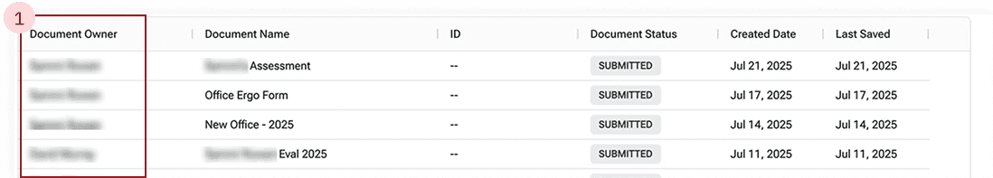
OLD VERSION
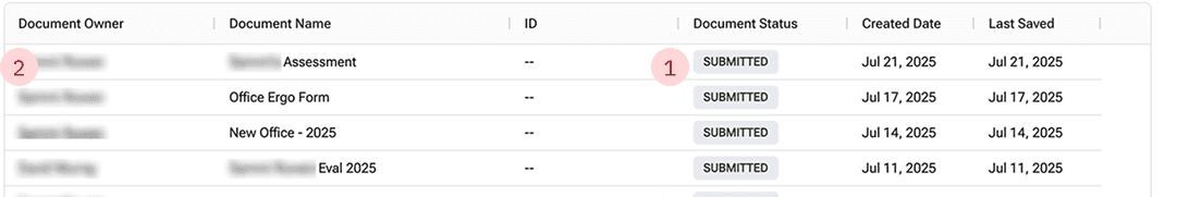
1
Status chips aren’t informative & visually too similar
2
No indication that rows are clickable to open document
NEW VERSION
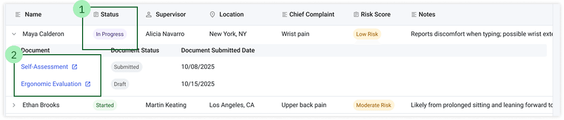
1
Customizable status and risk chips to track progress
2
Color and iconography work together to indicate an external link on click
Workflow and Decision Makring
OLD VERSION
1
Can’t group documents together
2
Information surfaced isn’t helpful for decision making
NEW VERSION

1
Grouping documents by person/case
2
Quickly surfacing key information from documents
VISUAL DESIGN
Adding new features & Improving visual design
To address collaboration (core need #3) and flexibility (core need #4), I created new features integrated in the table. To create these new features, I went through many iterations to help match RSS' current design system.
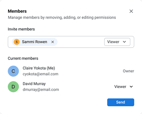
Collaboration Features
V1 Modal
Grays are not WCAG AAA accessible
Inconsistent buttons and icons
Touch target sizes are too small
Rounding and spacing are inconsistent
Final Modal
Gray 700 is accessible on white
Icons and buttons upgraded to design system components
Touch target sizes are at least 24 x 24
Rounding and spacing follows design system
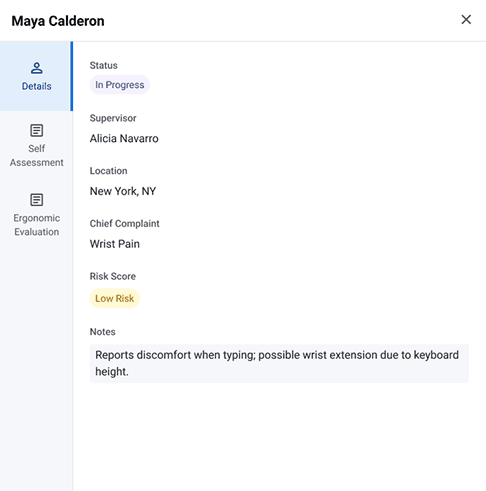
Flexibility in a different view
V1 Sidebar

Grays are not WCAG AAA accessible
Gray backgrounds confuse users, makes the fields appear editable, even though they are read-only
Final Sidebar
Gray 700 is accessible on white
Removing the background clarifies that the fields are read-only.
THE SOLUTION
Track safety information in real time with full ecosystem integration
REFLECTION
Challenges & Next Steps
Next Steps
Addressing Other User Needs: Further testing will assess dev-heavy features, such as automation, that users flagged as essential.
Business Goals: To maximize the project’s impact, we need to understand market demand, competition, production costs, and perceived product value. I’ll achieve this by consulting closely with Product Strategists and conducting competitive analysis.
What I would do better next time
Getting a grasp of the no-code constraints: Much of my design work didn’t account for the no-code nature of our products, resulting in features that weren’t scalable. If I could go back, I would spend more time upfront understanding how the products currently function.
