Squarespace
Streamlining booking page sharing for 100k+ users by consolidating fragmented workflows to reduce friction and drive trial-to-paid conversion.
ROLE
Product Design Intern
TEAM
Product Design Manager, PM, Engineer, CustOps
DURATION
Summer 2026
12 weeks
TOOLS
Figma, Claude Code, Figjam, UserTesting
CONTEXT
Company

Squarespace helps people build their business online. Its scheduling tool lets service businesses manage appointments, payments, and client bookings.
Problem
Admins had a page and a link, but sharing options were scattered across settings and separate guides, and the experience didn't guide them toward the next step.
Impact
The new sharing experience has been handed off to engineers and is currently in the development and testing stage. It's planned ot be officially released soon.
SOLUTION SNEAK PEEK
Sharing becomes easy-peasy!
Old
clunky and unintuitive

NEW
streamlined experience

Jump to Full Solution
PROBLEM
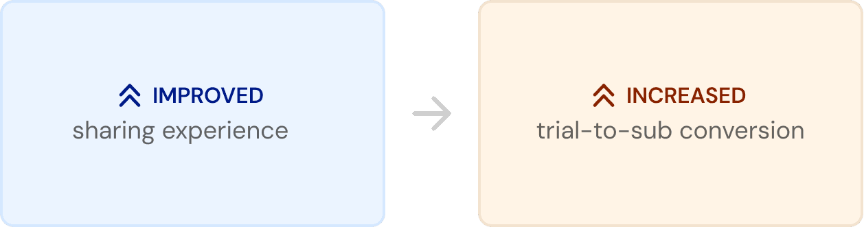
Free trial users are churning instead of converting due to never getting their first booking
The first booking is the “aha moment” that turns trial users into subscribers, but a clunky sharing experience was stopping users right before they got there.

HOW MIGHT WE
How might we improve the schedule page sharing experience?
…to ensure users maintain momentum at the most pivotal moment of their trial and improve trial-to-subscriber conversion?
DISCOVERY RESEARCH
Building a full picture of the problem through four lenses
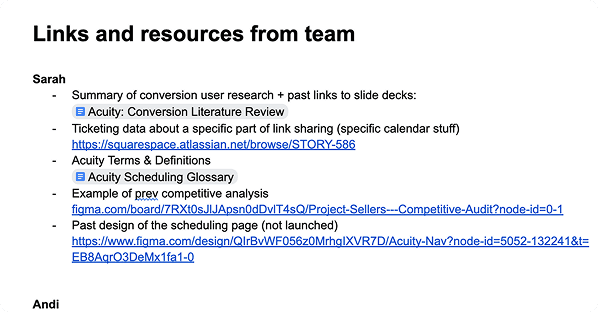
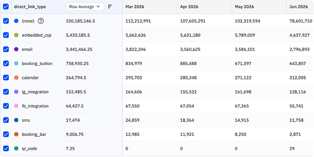
To understand the problem space better, I first took time to understand the full problem. Using competitive analysis, UX auditing, literature review, and stakeholder interviews, I ramped up on understanding the problem space as quickly as possible.
Competitive Analysis

UX Audit

Literature Review
Stakeholder Interviews
DEFINE
Both selecting what to share and how to share it were seperate broken experiences
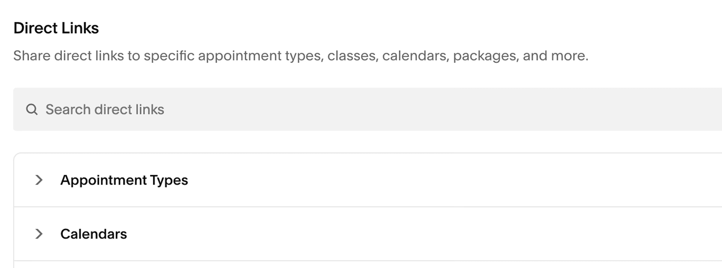
The current link page is cluttered and unintuitive. All the options are shoved into a lengthy unorganized dropdown, making it difficult for users to find what they're looking for. The sharing functionality existed across multiple areas of the product, but each entry point looked and behaved differently.
Step 1: Choosing what to share
Step 2: Choosing how to share it

USER TESTING
Should finding the right link be a navigational experience — or a generative one?
As I explored solutions, one core question emerged: should link discovery be navigational or generative? A navigational experience lets users browse all options without knowing exactly what they need, but can feel cluttered and difficult to parse. A generative experience is more focused, guiding users step-by-step to create a specific link, but assumes they already know what they’re looking for.
Prototype 1: Navigational

Prototype 2: Generative

DESIGN DECISIONS
Further improvements increased user confidence to 88%
A follow-up usability test with 8 participants confirmed this — pass rates rose to 88%, driven by the navigational layout alongside the clearer labeling and contextual guidance flagged in the first test.
1
Improved labeling

2
Navigational layout
3
Configurable links

SOLUTION
Track safety information in real time with full ecosystem integration
REFLECTION
First time working in industry
Ready to be shipped!
Working directly with developers and PMs to ship this product allowed me to think about the business and technical needs of the project.
Blockers lead to deeper thinking
Hitting walls throughout the process allowed me to step back and gather insights from other steams of information such as reaching out to our Customer Operations team. This allowed me to retackle the problem with a better understanding each time.
