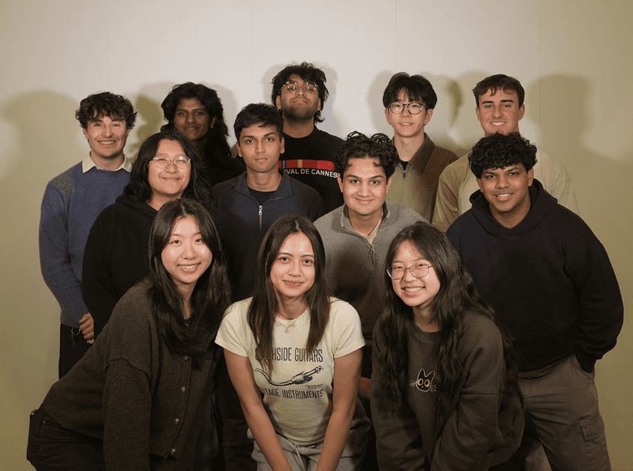
Bringing real-time Formula 1 race data and community-driven interaction into a 6.5M-member Reddit community.
ROLE
Product Designer (Contract)
TEAM
3 Designers, 8 Developers, 1 PM, 2 Mentors
DURATION
Spring 2026 (20 weeks)
TOOLS
Figma, Figjam, Notion, Jira

CONTEXT
Company

Reddit is considered the heart of the internet, where communities gather for conversation about the things they care about
Problem
F1 fans on Reddit had no way to stay informed and engaged with the race in real time, leaving the subreddit as a reactive discussion space rather than an active race experience.
Impact
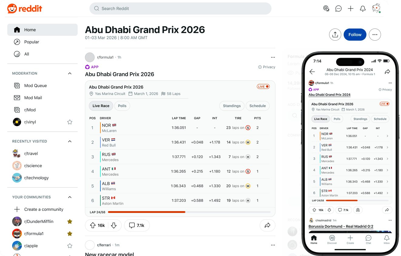
The new r/F1 scoreboard is launched! Check it out! Note that the scoreboard may be empty if the F1 season is not in-session.
SOLUTION SNEAK PEEK
Bringing real-time race scoreboards and fan polling to Reddit’s F1 community.
Scoreboard: stay updated

Community polling: stay active

Jump to Full Solution
PROBLEM
With so much happening during each F1 race season, what information is important to display to fans?
One F1 season spans 24 race weekends, each packed with media prep, three practice sessions, three qualifying sessions, and a main Grand Prix. With fans tracking results across every weekend to follow drivers and teams through the championship standings, there’s a lot to keep up with.
All the events occurring in one F1 season

DISCOVERY INTERVIEWS
With hardcore fans already well-served, I focused on casual fans.
After conducting 6 hours of interviews with various F1 fans, we identified two types of fans: hardcore fans and casual fans.
Hardcore fans

Care about the details, strategy, and technical nuances. Their needs are already well-served by F1’s official website.
Casual fans

Care about keeping up with the action and connecting with others, but struggle with jargon-heavy scoreboards and jumping between platforms.
COMPETITIVE ANALYSIS
We could differentiate by combining glanceable race overviews and community-driven features.
I also decided to look into some competitive analysis to get an understanding of whats currently on the table and how they meet the user needs. We found that most scoreboards lack a high-level overview that gives fans a quick understanding of whats going on. We also thought through what reddit can uniquely bring to the table. And that is, connecting with community

Competitors lack a lack a high-level overview or any community engagement features.
HOW MIGHT WE
How might we design a phase-aware F1 scoreboard that balances data depth with glanceability while fostering real-time community engagement on Reddit?
Our three focus points are 1) Seamless Integration - Bring critical race data into Reddit to keep fans informed in one place.. 2) Balanced Glanceability - Create a visual hierarchy that helps casual fans stay in the loop across all race phases. 3) Immersive Engagement - Increase thread retention and dwell time with structured prediction polls.

INFORMTION ARCHITECTURE
Organizing data across contexts and race phases for clearer navigation
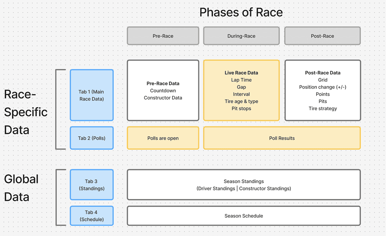
We limited the experience to four mobile-friendly tabs, organized into race-specific data and global season context. The main tab adapts to each race phase, while my contributions focused on the live race view and polls, highlighted in yellow.
DESIGN SYSTEM
30% of users use Reddit in light mode and 70% use Reddit in dark mode, so we designed for both
We then went onto iterating the solution. We also found out early that we should be designing for both light and dark mode, as 30% of users use Reddit in light mode and 70% use Reddit in dark mode, so we didn't want to neglect these large portions of users by just designing one mode or the other.

USABILITY TESTING
Balancing readability and usability within mobile’s limited screen space.
My team and I user tested with 4 participants, particularly recruiting casual fans to give us insights about their values and needs. We were particularly testing specific trade offs that we had in mind while designing. These were the 3 main design decisions we made from this testing
Prioritizing intuitive in-widget scrolling over expanding the page’s scroll area.
Touch area for scrolling



Prioritizing readability with larger type over fitting more information into the widget.

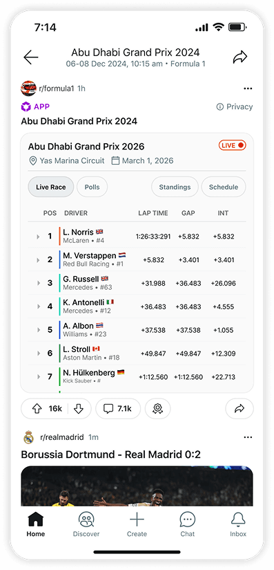
Finding a middle ground between readability and content density


SOLUTION
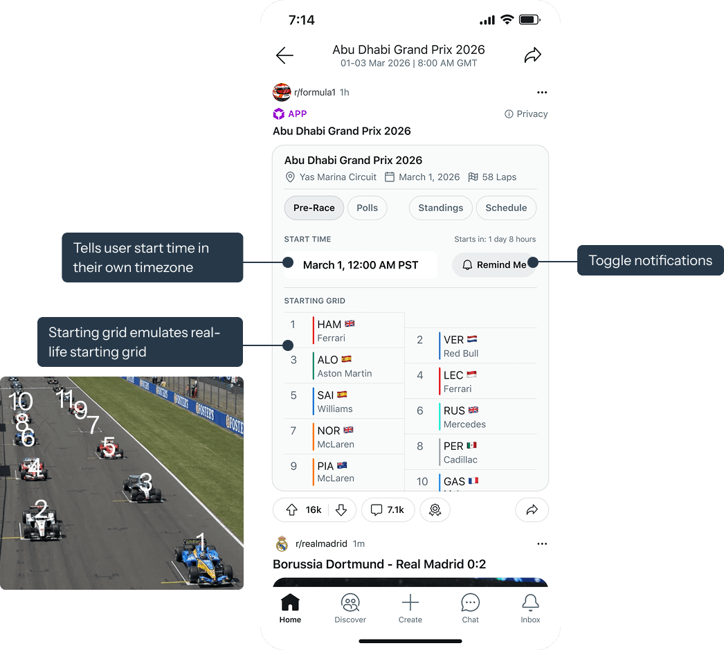
Pre-race, live-race, and polling screens keep users informed, engaged, and excited to interact.
Pre-race
Live race

Polling
DESIGN VARIANTS
Designing for responsive layouts and light and dark modes
We also made sure to flesh out the different views. that being, light and dark mode, in addition to desktop and mobile screens. This ensures that our feature works for all users and screen settings

REFLECTION
Learnings
Designing for multiple user settings
Designing across devices and Reddit's light and dark modes taught me to check every screen in each context early, since what looked right in one often fell apart in another.
Working within limited mobile screen real estate
Fitting data-dense tables onto a small screen pushed me to prioritize what users need at a glance and tuck the rest one tap away.